Wednesday 28 July 2010

Project 16 - Defining a Point

In this project I have been asked to list as many types of situation I can which would make a clear photo of a point, thinking about the types of background, types of subject, lighting etc.

For a subject to be considered a point in a photograph it must be small in the frame and contrast with its surroundings.

  • small object against a plain background
  • dark coloured subject against a light background
  • light coloured object against a dark background
  • object with a strong focal point within it ( I am thinking about the flower close up in the coursework folder for project 16, page 102, where the centre of the flower contrasts with the dark petals around it )
Specifically :
  • poppy in a wheat field
  • horse in a field of green grass
  • car on a road
  • aeroplane in  the sky
  • dog on a beach
  • kite in the sky
Colour can be an important factor in determining a good photograph of a clear point, but we shall be covering colour later in the course. 

I looked through my photo collection and also photos I have saved from magazines, for ones which I felt were good examples of the use of a point.  I have attached a couple of my favourites.

When searching for one of an aeroplane in the sky, I found it difficult to find one with the 'plane small enough in the frame.  This shot is of a Mustang and was taken at a local air display earlier this year.  Althoough there is a large cloud popping up in the frame, the darker and distinct shape of the 'plane is strong enough to be a good point in the image.
                                     
This image is of a poppy in a field of unripe barley.  Here it is the colour of the bright red poppy which contrasts against the green-yellow of the barley creating the point.  The background is actually quite fussy, but the colour contrast emphasises the flower, and the eye is drawn to it.

Tuesday 27 July 2010

Preparation

I spent the weekend (well, Sunday mainly) preparing for the next part of the course, which is Elements of Design.  It covers points, lines, shapes and (a bit later) colour. I'm quite looking forward to this part actually. I've been planning what photos I already have which I can use, and what photos I need to take (there's a lot!).  I'm getting a bit confused with the difference between "rhythm" and "pattern" so I'll have to look into that in more detail, perhaps a nosey around some blogs may help point me in the right direction.  If not, I'll have to post on the OCA forum...

I must also email my tutor and let her know that the next Assignment will be late (surprise) - the kids are on school holiday now, and while they are old enough to make their own entertainment, I find I am being called on for my taxi and cooking skills !

Wednesday 21 July 2010

Assignment 1 - amendments

My first assignment came back some weeks ago with suggested amendments from my tutor.  So I shall post the amendments here together with the comments she made which led to the amendments, if that makes sense?

Black
My tutor commented that using a black subject against a black background presents technical problems, eg lighting, which I should have addressed in my notes.  She also wondered if the foreground blur in the image is too dominant.
When I shoot I tend always to use natural light whenever possible.  I like the softness of natural light as opposed to harsh studio or on-board flash light.  When I took this particular image, i did find that the sunlight was quite harsh, it being around mid-day.  I was shooting in the sun room, so i found that if i closed the blinds (which are a light oat colour) the light was diffused enough for the black of the coal to be quite true.  I also adjusted the lightness levels in photoshop slightly, just to darken the black a bit more. 
Having looked again at this image I can see what my tutor means about the coal in the foreground being too dominant.  I often shoot with shallow depth of field, but I agree that the coal in front is too large in the frame to be blurred in this way. 
                                        
I looked through my shots and came across this one, where the foreground coal is in focus and the smaller lump at the back is blurred. 

White
My tutor commented that this was a straightforward and simple composition.  She suggested that I expand my notes.


I bought a pot of snowdrops at my local garden centre mainly with this image in mind.  The pot had been left outside for a few days and the water droplets on the petals are actually melted snow !  I positioned the snowdrop, still in its pot, by the front door which has frosted glass and so diffused the light nicely.  Again I used natural light as flash lights would have been too harsh, and there was enough natural light to get the image I wanted.  The white background is the back of a sheet of mounting card (I have several in various colours which I use for my flower work).  I trie several shots, focussing on different parts of the plant, but this one was the best.  I was a bit concerned that there was too much "green" in the image for it to represent "white", but I think I was wrong to worry.

Sour
My tutor said that she was disappointed that I had not included one of the images of my son tasting a sour lemon.  She felt the submitted image suggested "translucent" ratehr than "sour".  She thought I should have gone for a more expressive image.  This ties in with her final comments which suggest that I should try something "quirkier" now and again, and go with my instincts, even if it means following a more unusual route.
                                       

My son has a very expressive face and is quite co-operative luckily !  We sat in the garden so that we could use what sunlight there was.  I gave him a slice of lemon and shot away while he tasted it.  I chose this image as his face is showing a good and natural expression ( there is always the risk that a child will play up to the camera and over-act ) and the lemon slice is clearly visible, so the viewer is left in no doubt what is happening.
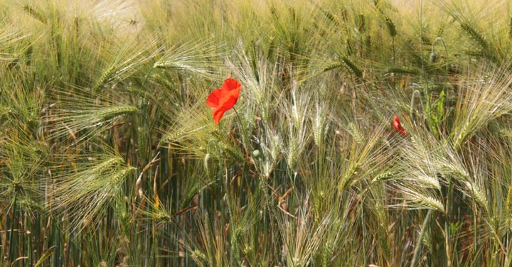
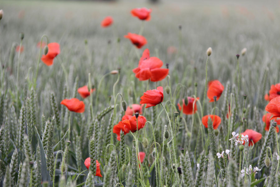
Many
My tutor asked to see some variations of the image - she guessed, quite correctly, that I had taken heaps !  She also asked whether I had explored suggesting movement.


The first additional image shows a vertical composition along the same theme.  There is some rape, but the majority of the image is taken over with red poppies.  The second image shows selective focus, and movement is suggested by the position of the poppies bending to the right and with their petals drawn very much to the right.  I like the image, but am not sure it conveys the idea of "many".  The third image shows the use of sunlight to back-light a subject, adding extra detail to the petals.  The image also has flare spots, which I don't normally like, but in this image I think they are acceptable.
Overall I think I still like the image I submitted originally the best, but it was nice to look at the rest of the images again.

Light
My tutor said that I had captured the soft floating movement of the light seed heads.  But she suggested trying a square crop to take in 3/4 of the dandelion head and everything to the right of it.
                                  
I do like this crop, and wouldn't have thought of doing it without my tutor's suggestion.  Again this was taken using natural sunlight on a fairly dull day, outside and using  black mounting card as a background.

Straight
My tutor suggested that the image would be more effective if cropped from the top to just above the tree line.
                               
This crop does emphasise the straight road, which I saw when out one day.  I made a mental note to return with my camera to get this shot for this assignment.  The crop ensures that the road acts as a perfect leading line from the front to the back of the image.

Curved
It was suggested that I should return to the idea of a direct pairing with the image for "straight" and use my "bend in the road" sign. 
I cropped the image down as much as I could to lose the distracting background, but I'm still not happy with it as an image.  The background is too messy still.  Although I can see the advantage of a "pair" with the image for "straight" I still think that the image of the bananas is better.

High
The suggestion for improvement here is that I include more written detail.
                                               
This is taken from the base of the CN Tower in Toronto, Canada.  I took it in July 2006 during a six week tour of the country.  It was completed in April 1975 and, at 1815 feet high, it remained the tallest freestanding structure in the world for 31 years.  Even now, it is still the tallest freestanding structure in the Western Hemisphere. 

Low
My tutor pointed out that there is a lot of distracting information in this image, and the subject matter is not clear.  She suggested making alterations by cropping or using phootoshop, or reshooting the idea, which is what I chose to do.
                                 
I liked the idea of shooting low to the ground, and thought that my garden would be a good place to do this.  In this image a solitary buttercup is surrounded by a ring of clover flower heads.  I like the simple composition and the suggestion that the image is taken from a low perspective is emphasised by the out of focus grass and clover in the foreground.  I focussed selectively on the buttercup to ensure that it stood out as a subject.

Black and White in One Image
My tutor commented that a zebra is an ideal subject for this brief.  But again I have to expand my notes.
                                     
This abstract of a zebra markings is my chosen image to demonstrate the two contrasts of black and white together in one image.  The image is straight out of the camera - I was shooting with this assignment in mind.  The image was taken at a local zoo earlier this year.  It is a Grevy's Zebra, also known as an Imperial Zebra.  In the wild these live in Kenya and Somalia.  The stripes on a Grevy's Zebra are thinner and closer together than on other species of zebra, and the pattern of stripes is unique to each individual zebra, just as a fingerprint is unique to each human.  The Grevy's Zebra is an endangered species.

My tutor also made suggestions about my blog as a Learning Log, and things that I should be including within it. This, along with her comments to make more comprehensive notes and outline any technical issues or editing, I hope will improve my photography.


Putting the course to good use.....

While we were out last Sunday, enjoying the glorious weather, we drove by one of my favourite views not far from where we live.  As luck would have it, I had my camera and.....

......... this is it !  The sky was wonderful and the wheat is almost ready, and that line of trees looked perfect.  So remembering what I had learned in Project 12 - Positioning the Horizon, I took several shots and this is my favourite.  Again, the horizon is placed low in the frame and the interesting sky justifies its large space in the image. 

Project 15 - Cropping

For this project I had to select 3 photos I had already taken and crop them to see if there was another, perhaps better, photograph within it. 


This image is of my older son at a karting track recently.  At the end of the session the chequered flag is waved for each driver, and I was positioned to be able to get a shot of my son crossing the finish line and taking the flag. 
In the original image, there is a lot of space all around the kart and flag, and the image looks messy and as if it was taken with little thought to the composition.  It would have been better straight from the camera if I had been using a longer telephoto lens to lose the distractions around the main subject.
In the cropped version I have taken the image down to the important details - the main subject being my son, and I have included all the flag.  Rather than your eye wandering around the image, it is now drawn straight to the driver and the flag.  Cropping in this way has given me the image I wanted to take, but wasn't able to as I hadn't got the right lens with me. 


This image is of a marigold from my garden.  I enjoy flower photography and do a lot of this kind of work.  I was pleased with the original image as it shows the layers of petals very well as well as the number of petals and the variation in their size from the outside in.  It also shows the colour nicely. 
I played around with several crops before deciding that this crop worked best.  I have cropped down to the top right of the flower which has also allowed me to lose the slightly distracting colour in the background.  By taking the image down to this crop the colour pattern of the petals is emphasised and the layering effect of the petals is high-lighted even more.By cropping in this way, we have lost the majority of the part of the image which was in focus, and this has created a lovely abstract.  I do think that this crop gives a more dynamic image.


This image of a dandelion head was taken for Assignment 1 - Contrasts, and represented "Light"  in "Light and Heavy".  I like the original image with the small hand holding the dandelion, as it makes us fully aware that a child is blowing the "dandelion clock". 
My tutor suggested, as part of improvements I could make to the image, that I make a square crop which removed the hand and showed the movement of the seeds.  This is what I have done in the middle image.  I do like the crop, and a square crop is not one which I would normally use.  So I thought that I would try a 3:2 (approx) crop which I would usually go for.  The bottom image shows this crop.  I like this one as there is more space for the seeds to move into.  Overall I think my tutor was right to suggest the crop, and I think that both the crops work well.

I enjoyed this project as it did make me look closer for pictures within my pictures.  The karting image was an obvious one to use as I knew when I took it that I'd have to crop it.  But I wouldn't have thought to look at the marigold picture with a view to cropping, as I was happy with it as it stood.  But the crop does make a good image too.  I knew I wanted to try and find another crop in the dandelion head image, as well as the one my tutor had suggested, and I was happy with the one I did find.  Overall I do try and get my images right "in-camera" - comes from years of shooting film i think.  This has been a useful exercise.

Tuesday 20 July 2010

Not going well.....

As you can probably guess from the date of my last post, I've not been able to do an awful lot for my coursework.  I've been a bit "tied up" with family issues here, and have spent most of each day on the phone, internet or at school.  My second assignment is meant to be with my tutor sometime around next week - I haven't even begun that section of the coursework yet.  And I still have to complete the final project of the current section ( cropping - is it project 15 ?) and finish the amendments to my first assignment. 

Need wine in large quantities.....

Wednesday 7 July 2010

Project 14 - Vertical and Horizontal Frames

For this project I had to shoot 20 photos using a vertical frame and then reshoot the same object/scene using a horizontal frame.

When I shoot I tend always to orientate the camera so that it best suits the subject, and will use both horizontal and vertical framing if the subject does not obviously lend itself to one or the other naturally. 

During this project I did indeed notice that, when shooting vertically I did somethime position the main subject slightly below centre in the frame.  It was also sometimes difficult to get a satisfactory image when the subject needed to be shot either vertically or horizontally and I was shooting the opposite way.  I also found that some subjects lent themselves to being shot in either format, producing a different "feel" each way. 
 

These poppies are an example of being able to use either orientation.  When shot vertically the poppies act as a leading line in the image, drawing the eye to the top of the picture and beyond.  In the horizontal format the eye is left to wander over the poppies and unripe wheat.

Again for this subject (ripening wheat) both horizontal and vertical framing is suitable.  The narrower vertical framing ensures the abstract pattern created by the light is prominent, and is therefore my favourite image.


Because of the shape of the military vehicle, it naturally suits a horizontal frame.  I was able to fill the horizontal frame with the vehicle.  In the vertical frame, the vehicle is less prominent and the tree is far more noticeable.  The vehicle is positioned on the centre line and lower half of the image.  The horizontal framing looks "right" to me - although if there was foreground interest in front of the vehicle on the grass, then vertical framing would seem appropriate.
                                                
                                    
These images were taken at a small air display.  I liked the pilots helmet hanging from the central wing above the cockpit, and his headset resting on the side.  Ideally I would have liked the plastic bag NOT to have been there!  The horizontal framing gives more of a sense of what the image is about - you can see more of the aircraft.  The helmet is central in the image and the wings and struts are balanced in the image.  The vertical image doesn't have the same balance.  The helmet is below centre and there is not much wing within the frame.
                                                   
                                     
This is a statue of Wellington in Norwich city centre.  The vertical image suits the shape of the subject, and I could have included less tree in the background to make the statue even more prominent.  The subject is positioned centrally ion the frame and the image is balanced nicely.  In the horizontal frame I have positioned the subject slightly right of centre to try and make the compostition more interesting.  With this subject central in a horizontal frame, it looked as if the picture had been taken with no thought to composition.  I like the amount of tree that I was able to include, and the statue is still obviously the subject, helped by the lighter green against the background.
                                               
                                
This is Norwich Cathedral. The tall spire lends itself to a vertical frame.  The horizontal frame is not a good view in my opinion - I had to zoom out to get all the spire in and this has necessitated me including more foreground than I would have liked.  I do like how the trees and bushes are beginning to form a natural frame around the cathedral though.


This pillar box is near the cathedral in Norwich.  Again the shape lends itself to vertical framing.  However, when using the horizontal framing I again set the subject a little off centre, this time to the left, and it has resulted in a much more interesting image.  I had to zoom out, but this time the stonework of the wall behind the pillar box has made for a more interesting background.  The vertical frame is simply a record shot of a pillar box, but the horizontal framing has given a more interesting composition, and is my favourite.
                                 
                                                
These are taken of Norwich Cathedral.I am not happy with the composition of either shot !  The horizontal shot could be improved by making more use of the natural frame of the window through which I was shooting.  I think for the vertical frame I could have shot from a lower viewpoint and included more of the spire (you can just see the base of the spire at the top of the picture).  I think that the horizontal frame would work better if I had concentrated more on the composition.
                                     
                                               
This is the fuel pump at our local airfield.  Although it should be easier to shoot this one vertically, I prefer the composition of the horizontal frame which has included less foreground clutter.  I wanted to include the handle and tubes to the left, which was easy to do horizontally, but when shooting vertically I had to zoom out and thereby included  things I didn't want.  Cropping would sort this out.


This was taken at our local airfield.  I like both of these for different reasons.  The horizontal framing give a nice record shot of the 'plane.  It fits well in the frame and is clearly taken in the context of an airfield.  The vertical framing introduces an interesting skyscape, with clouds acting as leading lines though the image.  The sky takes up half of the frame, and the 'plane is placed below the centre of the image, just cutting the horizon.  Because of the sky I prefer this image.
                                             
                                 
My son's bike in the yard.  Surprisingly the vertical frame works better I think.  This is probably because the shot is not "side on" to the bike, and therefore the shape is more vertical than it would have been.  The horizontal frame includes too much other clutter.


The vertical shot works better in this image of a plant pot in my garden.  It is below the centre line again (like many of the subjects of my vertical images).  
Poppy taken in a field.  I think both these images work well.  In the horizontal frame, more of the flower is showing and this suits the frame, but in the vertical frame, more of the stem is on view.  In fact it extends to the centre of the image.  I remember while I was taking this series of pictures that I thought that both orientations would work.  I like them both.


For portraits I try and shoot both horizontally and vertically.  I tend to think that if the subject is looking at the camera then a vertical frame often works better, but if they are looking away from the camera then a horizontal frame allows somewhere for the gaze to go.  In the pictures above, the horizontal frame is definitely better as the little boy is not engaging with the camera at all.  Even though he is not looking out of the window, the horizontal frame allows the viewer to see his reflection in the window, and you are left with a feeling that he will lift his eyes and look into the garden at any moment.

In the vertical frame above the girl is looking directly at the camera, but in the horizontal frame she is looking away and the spare space to the right is allowing her gaze somewhere to go.

However in these two images the girl is not looking at the camera but they are both appealing images, showing that there are no hard and fast rules.  In the vertical frame the subject is again lower in the frame than in the horizontal.  I like both these images, and so did the family - they bought both !


These are pictures of a groyne on Brancaster beach in Norfolk.  In the vertical frame, the groyne is placed mostly slightly below centre.  In the horizontal frame I again off-set the subject to allow for better composition.  As in previous similar images (statue, pillar box) I prefer the horizontal frame.


These are pictures of my younger son walking away from the camera along a lane in Norfolk.  The vertical frame mirrors the lane and gives a sense of depth to the image.  There are several leading lines in both the images - road, grass, white flower in the hedgerow - and these lines are more effective in the vertical image.

While shooting the project I deliberately tried not to look for tall things just to make the vertical image easier.  I have noticed that I placed the main subject lower in the frame in many of the verticals which is something I hadn't thought about before.  I also found that although I could shoot most subjects successfully vertically, with a bit of thought for composition I could make a much better image using a horizontal frame - I'm thinking about the pillar box particularly.  I was surprised that I liked the 'plane image with a vertical orientation so much - I think the clouds helped that a lot.  My natural instinct would always have been to shoot that kind of image horizontally.  And of course for many subjects both orientations will work, so it is still worth at least trying both.