Monday 31 May 2010

Project 8 - Recording a Sequence

Last December we had a Homecoming Parade in our town for the Regiment based here.  Although I hadn't planned to use these photos for this project, when I was looking through them recently I thought they would work well.

At the time I simply wanted to record the event - my younger son was there with his year group from school, but my older son was at school and my husband was working overseas.  I thought it would be nice for them to see the parade in photos.   I also wanted to try and get a photo which captured the youth of the soldiers and the job they were there to do.  I think the last photo in the sequence captures that.

In this image the two soldiers have taken up position by the dais where the salute will be taken.  The crowds have been gathering all morning in the cold weather, showing how important the parade is.

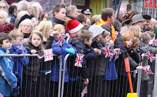
In this image the schoolchildren have been given flags to wave.  I like the colours and the expectancy in the image caused by the majority of the crowd looking in the same direction (and out of shot).

One of the soldiers looking anxiously in the direction of the parade.  Parades like this take a huge amount of organisation.
The police outriders arrive signalling the start of the parade.

I was happy with my position in the crowd here.  I had arrived early to get a place at the front, and I was near the dais so that I would see the salute being taken.  Because of the crowds, there was no chance of changing position anyway !


The start of the parade.  I tried various crops on this image as I felt initially that there was too much space around the main subject.  But I felt that none of the crops worked as the image needed the impact of the crowd and the buildings to put the event in the correct context (homecoming parade).  It also needed the Regimental Colours to be included in the image.


Taking the salute.  I zoomed in a bit to make sure that the importance of this moment wasn't lost with too much loose background.  Also the Regimental Colours are in this image - I'm pleased with this one as a record of the parade.


Now I began to try and get photos of the men and women as they marched by. 

                                       
I cropped this one to draw attention to the faces and expressions of the men.  Many of them were quoted afterwards as saying that they weren't able to look at the crowds or they would get too emotional.


Similar to the photo above it, and again cropped for impact.


Similar to the previous two photos, but I zoomed out a bit to include some of the surrounding buildings for context purposes.  But I think the image has less of an impact as a result.  Personally I much prefer the cropped close-ups for this.


The Band of the Paras marched in with the parade.  I like the detail of the Para badge on the music stands in this one.  With their heavy coats and gloves it reinforces how cold it was that day.


Again in this one I have included more of the surrounding buildings and also the dais is visible behind the soldiers who are saluting.  I wanted to include the people who were waving from the windows.


Very similar to the previous image - I included it as I like the arm on the edge of the image.  Normally I would have cropped this out, but I wanted to leave it in as it gives an idea of the support of the crowd for our soldiers.


Remember what I said about not looking at the crowds.....


Of all the photos of the soldiers marching through the town I think this one give the best impression of how young most of them are.  I also like how the image continues out of both sides of the frame.


This gives an idea of some of the work that the soldiers do, and it is blatantly clear just how dangerous it is from the armoured vehicles they are driving and body armour they are wearing. 


This is the picture which for me captures the idea of how young our soldiers are and the danger of the job they are trained to do.  I zoomed in on his face and upper body for impact, and I like the way that the crowds behind him are visible but not in focus. 

Although I did not shoot these photographs with this project in mind, by looking through the images and thinking about the day when I took them, I realise that my thought process would have been the same if I was shooting specifically for the project,  I knew that I wanted to record the morning's events and take photos which conveyed the atmosphere of the day.  It was also an aim that I tried to capture something which showed how young the soldiers are.  Finally I wanted an image which showed the youth of the soldiers and the dangers of the job they are doing.  To do this I chose a good viewpoint (I knew I wouldn't be able to move once the crowds had built up), and I shot a mixture of close-up and wider angle images.  I had to make sure that the lens I had on the camera was capapble of covering the focal lengths I needed.  


Friday 28 May 2010

Decisions, decisions.......

Right, I have decided on my final 8 pairs.

I shall drop "rough / smooth", as I don't think that the "smooth" fully conveys the idea of smoothness.  It is a kitchen pot, which is totally smooth to touch, but has a textured pattern on it which could give the impression of being rough instead.  I didn't see it at first, as I am used to the feel of the pot.  I do like the tree bark for "rough" though.
I am using the road photo for "straight" as several people have told me that it is effective in conveying the idea of straightness - Roman roads and all that.  I shall use the photo of the bananas for "curved", as I am much more pleased with this as an image than the road sign.  The idea of the road sign is, in my opinion, ok, but the actual photo isn't how I would have wanted it to be.  The background is too cluttered, and if I crop it down, it simply looks like a cut-out sign.  I couldn't get a road sign photo with a bend in the road behind it without compromising my safety on the roads around here.

So I have to contact my tutor and find out how to submit the assignment before I change my mind again !

Thursday 27 May 2010

Still on the Assignment !

So this is an alternative to my original "curved" photo.  I think I prefer this one. 


I still haven't decided which pair to drop though.  It was going to be straight / curved as I wasn't too happy with the road sign, but I quite like this banana, so I'm stumped again !  I'll have to decide over the weekend and then prepare to get the Assignment off to my tutor.

Tuesday 25 May 2010

Assignment 1 - the photos

Right, these, I think, are my final images for Assignment 1 - Contrasts. Except I have one too many pairs ! And I still have an extra option for "straight"!

This is my choice for a "photograph which demonstrates contrast "in one picture" ". It is clearly of a zebra, but is an abstract of the zebra's markings. To me, a zebra is synonymous with "black and white"


Smooth - pot from the kitchen. I tried to photograph gem stones, but somehow they didn't convey the idea of smooth. I also thought about getting my older son to smooth his hair with Brylcreem !


Rough - tree bark. Love the texture.


Transparent - the vase, the water.....


Opaque - milk. I liked the idea of the similarity with the image it is contrasting with.


High - the CN Tower in Toronto, from the base.


Low - lying on my front in the garden to get a low viewpoint.


Curved - sign for a bend in the road.


Straight - I need to decide whether to use this one or.....


Straight - .....this one


Heavy - we had this topsoil delivered today and I liked the idea of having to use machinery to lift something so heavy.


Light - the floaty dandelion seeds contrasts with the heavy bag of soil above.


Pointed - I like shallow depth of field shots, and in this photograph I feel it emphasises the sharpness of the pin.


Blunt - pencils


Sour - lemons on a lightbox. I like this as a more unusual composition.


Sweet - cupcakes. I did try to copy the composition of the lemons above for this one, but it didn't look right. I think it was because the cupcakes are not flat like the lemon slices. The composition of this image worked much better.


Black - coal. As black as coal......


White - snowdrop. I did have a play around in Photoshop to try and make this image whiter, but the petals simply burnt out. So this image is as it was straight out of the camera.


Few - lone poppy in a field of rapeseed. I like the contrast between this and the following image where the numbers of poppies is far greater than the rape.


Many - poppies
OK - so I need to decide which image to use for "straight" and also which pair is the weakest and can be dropped.

Still planning but getting somewhere.....

Well, I now have 9 pairs of contrasts. I have a spare pair in rough / smooth which I added over the last couple of days. I also have an extra option for "straight" as I had already got a photo of a lovely straight road near us, but over the weekend I was out walking with my younger son and we saw crops just beginning to come through which had been sown in lovely straight lines. I'll have to decide which to use.

I have also got my photo which demonstrates one contrast in a single image. I have chosen an abstract I took of a zebra's markings. It's clearly a zebra, and to me "black and white" jump into your mind when I think of zebras.

I have also begun to pull some pictures together for project 14 which is the "vertical and horizontal in a frame" project. So far I think I have 3 pairs out of the required 20 or so pairs. Plenty to be getting on with then. I also have to give thought to the horizon placement project, project 12. I did take some photos for this at Sheringham but forgot to take one with foreground interest ! D'oh !!

I also need to look at project 8, recording a sequence. I did take pictures of a small demonstration in the city, but haven't looked through them properly with a view to using them. If they aren't really usable, maybe I will visit a market. I have got a series of pictures I took at a homecoming parade in December - they may work..... Hmmmm I'll have to give it some thought.

Monday 24 May 2010

Planning the Assignment still .....

Although I've decided on my 8 contrast pairs, I thought it'd be an idea to have a pair in reserve, so to go with:
sweet/sour
straight/curved
heavy/light
black/white
many/few
transparent/opaque
high/low
pointed/blunt
I have decided to add rough/smooth and possibly moving/still just so that I have more options when choosing what to submit.

Today has been a shambles photographically speaking - I have only taken one usable photo for the assignment. Tomorrow I am stuck in all day waiting for a delivery, so I hope to get more work done then.

Fingers crossed

Thursday 20 May 2010

Planning Assignment 1 - Contrasts

That's just about all of my notes written up now from when I began the course last year, so most of the stuff from here on in is new !

I have (and had) been giving the first assignment plenty of thought. My photos so far are on my flickr page www.flickr.com/photos/sue-in-nz/ in a set all of their own. I have decided on the 8 pairs and have, I think, 11 of the 16 required photos. I have a few ideas for the photo which includes both contrasts in one image. Between now and the middle of next week I intend to get the final 5 pictures done, and then post them all on here with a bit of explanation of my thought processes.

I'm also doing a 365 project which is on my flickr page - a photo a day for 2010 ! Nothing to do with the OCA - that one is all for me !

That's it for one day - it must be wine o'clock now !

Project 11 - balance


3642
Unequal objects balanced as the larger object (arch) extends from the centre of the frame to the right hand side. Smaller subject (boy) is on the edge of the left hand side


3750
Two objects of similar size (both hay lorries) placed equidistant from the centre of the image. Only slight distraction is the small stack on the far right


3149
Poppy flower with stem central and petals radiating out from the central stem. Vertical symmetry.


3726
Again the smaller object (bench) is positioned towards the left hand edge of the frame and the larger object (footpath) extends from the centre of the frame to the right hand edge. It took a while for me to realise that the footpath balanced the bench in this image


0753
Moeraki Boulders, NZ. The largest boulder on the right is closer to the centre than either boulder on the left. However I think the smallest boulder could be cropped out and the picture would still be balanced because of the position of the largest boulder. The picture works best with the three boulders though. If you cover the middle boulder I don't think the picture is so appealing - perhaps the distance between the objects is too great? In this case maybe a lower viewpoint would have helped.


0441
The central character of the group is in the centre of the picture. The two children, although different heights, are so close to the central character that they give an idea of symmetry around Taz. Vertical symmetry.
The image I found hardest to identify the balance in was 0753 - the Moeraki Boulders, NZ. I really like the image and looking at it closely for this project made me wonder if a different compostion would have appealed to me as much. I think a lower viewpoint would have worked, as would getting in close with a wideangle lens as in project 10. Whilst I also think that the smallest boulder could be cropped out without upsetting the balance, I think the addition of the third boulder is more pleasing aesthetically.
note - I need to return to this project to add the balance scale sketches to my ring binder file under a tab of project 11. see original log book for sketches